
Quick answer
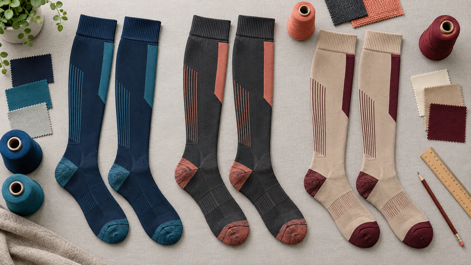
A production-ready compression sock palette starts with the customer and sales channel, then assigns a base, secondary and accent color to defined knit or print zones. Buyers should identify each color with an appropriate physical textile reference, choose stock yarn or a custom-color development route, approve the shade on the actual stretched construction, and agree on colorfastness, bulk shade and reorder controls. A screen image or color name is useful for direction, but it is not a sufficient production standard.
Color is often the first part of a compression sock that a customer notices, yet it is one of the easiest specifications to leave ambiguous. A mood board may show an attractive palette without explaining which blue belongs on the leg, whether the logo is knitted or printed, or how the shade should look when elastic fabric stretches over the calf.
For a private-label buyer, color design is both a brand decision and a manufacturing system. The goal is not merely to select appealing swatches. It is to translate the intended palette into named zones, feasible yarns or inks, approved physical samples, relevant colorfastness tests and repeatable bulk controls.
Start with the customer and sales channel
Define where, when and by whom the sock will be worn before opening a color library. Healthcare teams may need uniform-compatible neutrals or department colors. Travel and wellness ranges may favor versatile shades that coordinate with ordinary clothing. Running or team programs can use higher-contrast accents, while a gift or fashion channel may support seasonal palettes and more frequent launches.
Record the target age group, brand position, selling season, footwear context and merchandising environment. Online marketplaces also need colors that remain distinguishable in thumbnails; a wholesale presentation may need a compact palette that a retailer can assort without taking excessive inventory. These inputs are more useful than labeling one shade as universally fashionable.
Map every color to a product zone
A simple three-level architecture helps a design team move from inspiration to a technical drawing:
- Base color: the dominant leg, foot or full-body shade that carries most of the visual weight.
- Secondary color: a supporting zone such as the cuff, heel, toe, arch panel or pattern field.
- Accent color: a limited highlight used for a logo, stripe, size code or small motif.
Name the exact start and end of every zone on the artwork. “Navy sock with coral detail” is not enough if production cannot tell whether coral applies to the cuff edge, heel, toe, logo and packaging. Identify the inside and outside leg, left and right orientation, repeat size, number of knit colors per course where relevant, and whether an element is knitted, transferred or otherwise printed.
| Zone | Design question | Approval reference | Common production risk |
|---|---|---|---|
| Body / leg | Solid, marl, gradient or patterned? | Knitted sample in final structure | Elastic showing through when stretched |
| Cuff | Same as body or contrast band? | Sample at relaxed and worn extension | Color or logo distortion at the top |
| Heel and toe | Reinforced, contrast or base color? | Inside and outside inspection | Different yarn lot or coverage changes shade |
| Logo / motif | Knitted or printed, and at what size? | Knit-down or print strike-off | Fine detail closes, spreads or breaks |
| Packaging | Should print match the textile or only coordinate? | Separate substrate-appropriate standard | Paper and textile appear different under light |
Use the right color reference for the material
A color code must identify its system and medium. Pantone explains that its Fashion, Home + Interiors system is intended for fashion and soft goods, while its graphics system addresses ink on paper and related graphic applications. Within FHI, TCX identifies cotton textile references. A TCX textile reference may therefore be a more relevant starting point for apparel than a graphics code selected for a printed box.
That does not mean a cotton swatch will reproduce identically on nylon, polyester or an elastic blend. Pantone's Cotton Swatch Card is a physical cotton standard; it is not a promise that every fiber, dye system or knit construction can achieve the same appearance. Ask the mill to assess feasibility and submit an actual yarn or knitted match.
RGB, HEX and on-screen images are useful for artwork exchange and ecommerce planning, but screens vary by device, calibration and viewing conditions. A graphics reference for a hangtag should not silently become the textile standard. List separate targets for sock yarn, printed artwork, packaging and accessories, then define which approved physical item governs each one.
Choose a sampling route for each color
Sampling terminology can vary by supplier, so define the expected deliverable rather than relying on a label alone. A practical sequence may include:
| Route or stage | Best use | What it can confirm | What it cannot confirm alone |
|---|---|---|---|
| Stock yarn selection | Faster programs and lower color commitment | Available yarn shade and basic coordination | Exact brand match or future uninterrupted supply |
| Lab dip or yarn dip | Custom-dyed yarn development | Dye direction on the proposed fiber or yarn | Final knitted appearance, stretch and compression performance |
| Knit-down | Knitted logos, patterns and solid zones | Shade interaction, coverage and structure | Complete sock fit, placement and all finishing effects |
| Print strike-off | Printed graphics or transfers | Ink color, registration and detail on a defined substrate | Full production consistency or durability after use |
| Pre-production sock | Final approval before bulk | Color, construction, placement, fit and packaging together | Every possible bulk-lot variation without agreed controls |
Stock yarn can reduce development time, but availability should be reconfirmed for the order and likely reorder window. Custom dyeing may support a closer brand target, yet it can introduce yarn minimums, sample rounds, surcharges and longer lead times. Ask the supplier to separate sock minimums from yarn-dye minimums so the commercial effect is visible.
Design for knitting and stretch
A compression sock is viewed in two states: relaxed off the body and extended during wear. Stretch can open stitches, lighten a dark field, expose a plated yarn or change the apparent width of a motif. Rib, mesh, terry, reinforcement and different yarn lusters can make one nominal shade appear different across zones.
Fine logos may lose counters or sharp corners when converted to a knit grid. Gradients may require a limited number of yarn colors rather than a continuous tonal transition. Marl effects deliberately combine colors and should be approved as a blend, not judged as a solid. Printed designs must also account for distortion around the ankle, calf and heel.
Request artwork at the actual stitch or print scale and approve it on the intended size. Inspect the smallest and largest sizes because the motif may use different repeats or stretch ratios. Color development should not alter yarn type, stitch density or dimensions without reviewing whether pressure and fit evidence remain applicable.
Control the number of SKUs before launch
Every color multiplied by every size and packaging language creates another SKU. Six colors across four sizes already produce 24 sock variants before pack counts or regional labels are added. A wide palette can therefore fragment forecasts, increase leftover yarn and make minimums harder to allocate.
Build a core-and-accent plan. Core neutrals can carry deeper inventory, while one or two seasonal accents can test demand. Reuse a base yarn across multiple patterns where the factory confirms compatibility. Ask for the MOQ by style, color and size, plus any custom-yarn minimum and allowed allocation. Our compression sock MOQ and lead-time guide explains why these quantities must be separated.
Approve color visually and instrumentally
Visual approval should use an agreed light source, viewing geometry, background, sample orientation and trained decision makers. The current AATCC EP9 provides a standardized procedure for visually comparing textile color differences. State which side and area of the sock will be evaluated, and compare equivalent structures at a defined extension where appropriate.
Instrumental measurement can supplement visual review with agreed color-space, illuminant, observer, instrument settings and specimen preparation. A numeric difference is not self-explanatory: acceptable tolerance depends on the material, shade, structure, end use and buyer-supplier agreement. This guide intentionally does not prescribe one universal Delta E limit or pass grade.
Keep a signed master sample or approved knit-down, the measurement data if used, approval date and color-lot identity. Define what happens when visual and instrumental assessments disagree. The purchase specification should name who has final authority and whether conditional approval requires a new sample.
Match colorfastness testing to real use
Color approval at delivery does not show how a sock will behave after laundering, perspiration and friction inside footwear. Select methods and acceptance criteria for the target market with a qualified laboratory. Relevant ISO method families include ISO 105-C06 for laundering, ISO 105-E04 for perspiration and ISO 105-X12 for rubbing.
Light fastness may matter for products displayed in sun-exposed windows, used outdoors or expected to retain shade under specified light exposure. If it is relevant to the brief, consider an applicable method such as ISO 105-B02; do not add the test automatically without defining the exposure and requirement. Confirm the current edition and the exact conditions with the laboratory when the test plan is issued.
Evaluate both color change and staining where the selected method calls for them. Contrast cuffs, dark bodies, light logos and multi-color packaging sets may need special attention. Do not advertise a product as colorfast, fade-proof or non-staining without defining the claim and holding evidence for the approved material and colorway.
Plan bulk shade and repeat orders
Bulk yarn should be traceable by supplier, dye lot and production lot. Agree whether different dye lots may be mixed within one pair, retail pack, carton or shipment. Establish how many bulk samples are checked, from which locations, and against which approved standard. Record visual and instrumental results when both form part of the contract.
For repeat orders, do not rely on a photograph of the first shipment. Retain the governing standard and a protected production reference, then state whether the reorder must match the original master or the most recently approved bulk lot. Aging, handling and storage can change physical references, so identify replacement and reconciliation procedures.
Put color controls into the RFQ and QC file
A useful RFQ lists each colorway and zone, the reference system and code, physical standard owner, fiber and yarn route, decoration method, order quantity by size, packaging colors, sample sequence, approval responsibility, required tests, bulk tolerance method and reorder rule. Attach numbered artwork rather than describing placement in email.
The quality file should include approved yarns, knit-downs or strike-offs, final sock samples, light-source conditions, measurement settings if used, colorfastness reports, dye-lot traceability and defect photographs. Check logo placement, shade consistency within a pair, contamination, barré, exposed plating yarn and unintended color transfer during bulk inspection.
NextCompSox can review a project brief without assuming that every target color, custom yarn or decoration is immediately feasible. Send a compression sock color-design RFQ with your target market, quantities, sizes, artwork, color references, sampling route and test requirements for project-specific evaluation.
Buyer takeaway
A successful palette connects brand intent to a controllable production reference. Limit the first assortment to commercially useful SKUs, define every color zone, approve the actual knitted or printed result, test for the intended use and preserve the records needed for bulk and reorders. That discipline gives creative colorways a much better chance of arriving consistently at retail.
Frequently asked questions
Should I use Pantone TCX or a graphics Pantone code for compression socks?
For textile color direction, a Fashion, Home + Interiors textile reference such as TCX can be more relevant than a graphics code intended for ink on paper. However, the final governing standard should be the approved result on the actual yarn and knit construction. Use a separate substrate-appropriate reference for printed packaging.
Can a supplier match a compression sock color from a HEX or RGB value?
A digital value can communicate direction, but it should not be the only production standard because screens and materials reproduce color differently. Provide an appropriate physical reference and approve a yarn dip, knit-down or finished sample under agreed viewing conditions.
What is the difference between a lab dip, knit-down and print strike-off?
A lab or yarn dip develops a dyed color on a proposed material, a knit-down shows yarn colors in a knitted construction, and a print strike-off shows a printed design on a defined substrate. The required sequence depends on whether the design is knitted, dyed, printed or combines methods.
How many colors should a first private-label compression sock range include?
There is no universal number. Calculate colors multiplied by sizes, pack formats and label versions, then compare the resulting SKUs with demand, MOQs and inventory capacity. A focused core palette with a small seasonal accent group is often easier to validate than a broad untested launch.
What colorfastness tests are relevant to compression socks?
Laundering, perspiration and rubbing are common use-related considerations. Light fastness may be relevant for outdoor use or prolonged display exposure. Select the applicable method, conditions and acceptance criteria with the laboratory and target-market requirements rather than applying one test plan to every project.
Can one Delta E tolerance be used for every yarn and shade?
No universal tolerance suits every material, construction, shade and end use. Buyer and supplier should agree on the measurement setup, physical standard, visual assessment procedure and project-specific acceptability rule before bulk production.